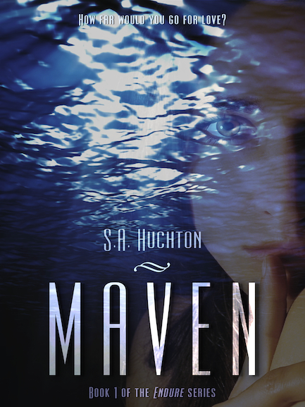
Maven (The Endure Series, Book 1), by S. A. Huchton
“How far would you go for love?
Since losing her parents at 14, young prodigy Dr. Lydia Ashley has focused on one thing: an appointment on the Deep Water Research Command Endure. Now 21, she’s about to realize that dream, but nothing is how she imagined it would be. Her transitional sponsor forgets her, her new lab is in complete chaos, and, as if that weren’t enough, she’s about to discover something so horrific it could potentially destroy all life on the planet.
Daniel Brewer, a noted playboy and genius in his own right, may be exactly what she needs… Or he may make everything worse.
Has she finally found a puzzle she can’t solve?” (via my other site)
This is maybe the most exciting cover I’ve gotten to share in a long time.
Mostly because it’s mine. I am finally releasing a new novel-length piece of fiction into the world!
But, that’s not what I’m here to talk about on this site. If you want to know more about this series, including release info and excerpts, I’d encourage you to have a look at this post over here. Here, I’ll be talking a bit about the actual design.
I did a guest post for today on another site, in which I address the differences between designing for myself versus designing for a client. The biggest difference is really the amount of time I could dedicate to the image. Since I had some time before I knew this book was going to go live, I spent months tweaking this image, as well as working on two others in the series. I haven’t done the fourth one yet, as I wasn’t sure who was going to appear on it, but I’ve recently settled on an option so that will change soon.
So, my challenge here was communicating the feel of the story without alienating potential readers that might be turned off by either the Science Fiction or Romance labels I’ve given this series. It is both of those things, and my hope is that it will pull readers from each circle into an area they wouldn’t normally have considered venturing. There are certain stigmas attached to both of the terms in the SFR genre, and I’m sure readers of each can tell you what they are. I firmly believe this story is one that can appeal to both of those audiences. I’m hoping it bridges a gap between the two that encourages some readers to explore outside of their normal fiction comfort zones. There’s always the chance I’ll end up alienating both, but I’m crossing my fingers that won’t happen.
That said, these things played heavily in my design decisions. I actually balked at putting Lydia on this cover, for fear I’d chase away male readers (Coverflip, anyone?). In the end, *I* really liked the choice, so I stuck to it. In order to soften some of this perceived femininity, my font choice needed to be a little more modern-looking. It is still sci-fi, and set in the future, so this one really had the right feel for me. The bold lines and thinner profile give it an almost aerodynamic feel, like future tech would have.
I’m hoping the cover is well-received in both genre communities. This is a book I’m pretty proud of, so I want to see it succeed, but mostly, I hope people enjoy the story. If I’ve done my job, this cover will give it the chance it needs to do that.
***Update!***
Maven has received a gold star in the June 2013 eBook Cover Design Awards! Normally, I’d leave it to my clients to submit my work for these things, but since I was the author in this case, I submitted this one myself. It seems they liked my design too! If you want to see the comments on my entry, either click on the badge above or the link below it. Maven appears about 2/3 of the way down, but the covers don’t appear to be in any sort of order. Maybe as received? Whatever the case, thanks to thebookdesigner.com for the recognition!
Leave a Reply