Paradise Palms, by J. R. Murdock
“Half of Sam Jeffrey’s best friend was discovered in the woods around the Paradise Palms trailer park. He is determined to figure out what happened.
Young genius, Lin Pza Pza has had someone hacking into her servers and is determined to find out who it is with the help of her Canadian counterpart, Tiger Lily Smith.
Both investigations lead to the same discovery: the Paradise Palms trailer park is traveling to prehistoric times.
That’s when the real adventure begins.” (back cover copy)
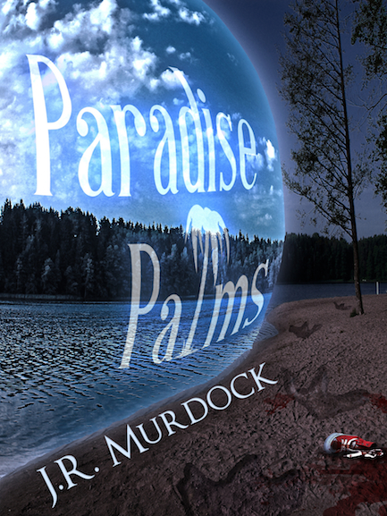
This is the second cover I’ve done for Mr. Murdock, and posed a very different challenge than the last one (V&A Shipping). Time-traveling trailer park? Dinosaurs? Murder mystery? Uh… okay. Let’s do this. *cracks knuckles*
Based on client feedback, I took a little inspiration from Stephen King’s Under the Dome cover, which I think is a brilliant design. There was an immediate challenge in doing so, however. When you’re Stephen King, you can have your title in all kinds of tiny, light letters, but that doesn’t really work for small indie authors who are looking to build visibility. I find I often struggle to balance wanting to use very delicate elements with the need to be blatant and noticeable with my covers. So many times they end up turning out much heavier than I’d prefer them to be. But, when you’re talking about clients that pull a good majority of their sales from online, where covers are displayed at thumbnail size, there’s just very little you can do here. There are certain rules I have to follow or my client’s work will be sunk. A big title in bold letters is often one of those must-haves. Readability at thumbnail size isn’t a suggestion anymore: it’s a requirement.
There was lots of layering on with this image. Dino footprints, time bubble (where I even got to use the usually useless Spherize filter!), multiple copies of the text to achieve the effect there… lots of them. Top that off with all the adjustment layers to turn a daytime lake photo into the appearance of a nighttime one, and things get messy very quickly. This is where properly naming layers becomes important. It’s super easy to lose track of what you’re doing. You’ll be working on one footprint, applying filter after filter and wondering why it’s not changing, only to discover you had the wrong layer selected. Uh, not that I did that, of course. >_>
So, that’s Paradise Palms. As of this posting, it’s not available yet, but will be soon, at which point I will update here.
Leave a Reply