Tattoo, by Paul Elard Cooley
“Scars. They remind us who we are, what we are and where we have been. But when a scar takes away your identity, what would you do to get it back? Jackson, a journalist in Houston, discovers links between several murders that have taken place in his city. His investigation draws him into the world of body art where he discovers an obsession worth killing for.” (via Paul’s website)
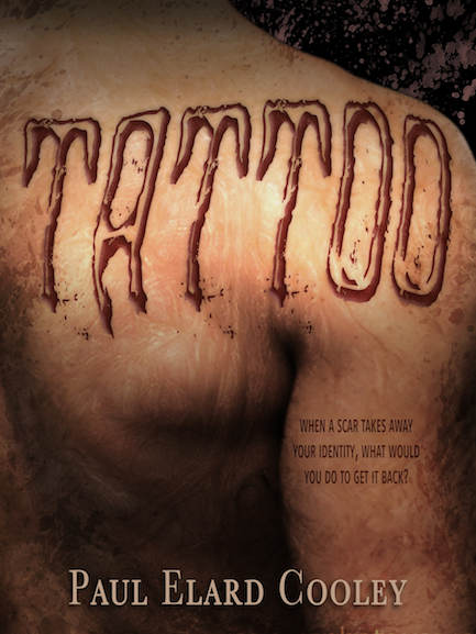
I pretty much dig this design a lot. It’s got that grungy horror feel that I wasn’t actually sure I could pull off when approached with this cover initially. Because my other covers for Mr. Cooley are much cleaner in nature (and he says they’ve been pretty successful this way), I was hesitant to go that direction. But, this story is completely separate from his Garaaga or Tony Downs stories, so I also wanted to make sure there was a distinct visual difference to communicate this.
I’m not a fan of exact depictions on book covers. I believe cover images should be representative, rather than literal. That’s why you don’t see any of the tattoos actually mentioned in the story on this cover. I didn’t want to give a reader any preconceived notions about what the details were, either disappointing or raising expectations too much. Instead, I focused on the scarring responsible for kicking off the crime spree. Still, no one necessarily wants to get up close and personal with some really nasty keloids, so I had to be subtle about this. Enter the blending modes! Utilizing this technique (the Overlay setting in this case, I think), I was able to give the appearance of texture on the skin without making it too in-your-face-gross-out. They’re still there, and there’s a definite visual interest, but it’s carried off in an almost artistic, painterly fashion. The result made me very happy.
Next up was the title text. I didn’t want to just throw something up there and mess up the image. So why not make IT the tattoo? Best. Idea. Ever. Sometimes, I’m surprised at what a genius I am. (Kidding! It’s not really surprising at all.) ;P
I gave the text a little texture (embossing, shadowing, etc), plus blending modes (of course), and then warped the word to conform to the contours of the body below it. After adding in the author name it still felt like something was missing, but a grunge overlay, mostly around the edges, gave the whole thing the framing it lacked.
This is one of my favorites I’ve done in a while I think. Morbid? Maybe. But maybe it’s just cuz it works.
Leave a Reply