Temporary Engagement, by Cairenn Lawless
“Something’s rotten at the chic Devlin Stone Public Relations Agency… and you don’t need Shakespeare or Sherlock Holmes to figure that out. When aspiring actress Lyssa Kendall shows up to replace the boss’s AWOL executive assistant, she sniffs the drama in the air right away. (She also likes the aftershave worn by sexy-but-skittish Devlin Stone.) But is Mr. Perfect paranoid… or is someone (besides Lyssa) really out to get him? Too bad this office stint is only a ‘temporary engagement’ between theater gigs… for the first time ever, Lyssa wants to ‘keep the day-job’.” (via the description on Amazon)
My projects always vary a lot from one to the next, and I’m never sure what’s going to pop up in my inbox. Today, I’m happy to welcome a new author to the fold, this time one who works as an editor and journalist, just starting on her own fiction publishing journey.
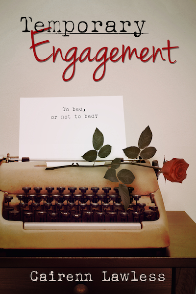
In discussing concepts for this image, I took away a few key elements that needed to be expressed. When it comes to book covers, I can’t stress how important it is to narrow it down to the absolute bare minimum. Trying to cram too many elements into one design is a sure way to spell disaster. The most successful covers are often the simplest. With that in mind, I pulled out what I felt was the most important pieces of the story.
First off, this is a romance, so it needed to express that feel, though not in an overblown way (the author and I both agreed on this immediately). This story also contains a good amount of humor, and a half-naked man or couple here would have been disingenuous. The single rose gives this just the right touch of romance without going overboard, and the loopy, cursive script of the second half of the title is a nice accompaniment.
Second, for story elements, I wanted to set the stage for time and place. The novel is set in the 1980’s, so it needed a bit of a throwback feel. The heroine is also a temporary secretary in between acting jobs, so what better than a retro typewriter and some color toning that’s a little faded? The typewriter font in the first part of the title and the author name also speaks to clerical work.
The last element for the cover was the tag line. It’s meant to be a bit of a throwback to the acting roots of the heroine, a play on Shakespeare’s “to be, or not to be?” quote from Hamlet. The author suggested it be on a crumpled piece of paper, but in keeping the cover simple, it seemed better to leave it on the typewriter’s paper to keep the design uncluttered while still incorporating the text into the design, rather than simply thrown on the image.
Ms. Lawless was very pleased with the result, and I am, too. I hope her new venture goes well for her!
Leave a Reply