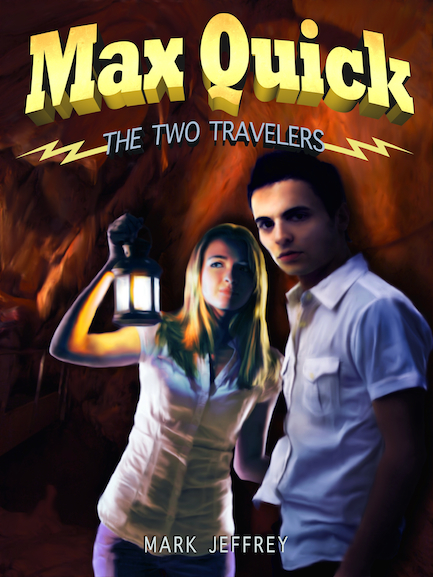
Max Quick: The Two Travelers, by Mark Jeffrey
“Five quiet years have passed in Starland, California since the the time of the Pocket. But when a crazed old man shows up with a warning, Max, Casey, Ian and Sasha suddenly find themselves on the run. Max and Ian go through an Arch back to 1912, where a mysterious Machine is under construction that seems connected to Max’s unremembered secret. Meanwhile, Casey and Sasha follow the old man to the strange town of Arturo Gyp.
But there is more afoot than meets the eye: the enemies of Mr. E – the nefarious Archons – are abroad. And when Max is at last eye-to-eye with his secret, he realizes nothing will ever be the same again…” (via podiobooks.com)
As a redesign, the cover presented several challenges. The first book in the Max Quick series was published by Harper Collins in 2011 and featured great hand drawn artwork. Illustration is not one of my talents, unfortunately, so my first problem was finding a way to turn a composite photo image into something that looked painted or hand drawn. Since the release of Photoshop CS5, Adobe added this brilliant new mixer brush tool that I’ve been itching to use for ages. This was a perfect opportunity to utilize that particular technique. It can be very time consuming, but the results are very much worth it.
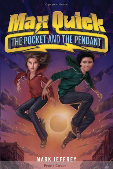
My next issue was how to make the new book 2 cover look similar to book 1 without being an exact copy and violating all kinds of IP laws. The title text was especially tricky in that regard. Mark and I decided we needed to carry over the lightning theme, but in the designing I found the gold subtitle box of book 1 (see below) overwhelming for the image on the second book. Hence, the simple bolts framing the words seemed like an excellent answer to both problems.
It does have a Hardy Boys/Nancy Drew feel to it, but book 1 had a lot of that sort of vibe to it, only with more of a sci-fi/fantasy bent. The consensus seems to be this cover has a greater mainstream appeal that the original version and geared toward a slightly older audience than book 1, which is exactly what it’s meant to achieve.
Here’s the cover of The Pocket and the Pendant for comparison. I’m pretty pleased with my interpretation for the sequel.


Leave a Reply